When my friend Darren asked for help to produce a new headshot to use on his website and social media, I was happy to oblige.
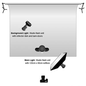
We decided that a white backdrop would give the most flexibility across various platforms – LinkedIn, Facebook, etc. The white paper roll was lit with one Elinchrom flash unit – bare bulb with reflector dish and barn-doors to avoid light spill. I lit Darren with another Elinchrom fitted with a large softbox. Very simple lighting, easy to setup. See the diagram below.
The key to achieving a solid white background in these type of photographs, I find, is to have the light on the background around one stop brighter than the light on the subject, so for example:
- If your main light on the subject is set to f/5.6, then the background light/s would be set to f/8
- If your main light on the subject is set to f/8, then the background light/s would be set to f/11
See this earlier blog post for more information on lighting a white background.
How do you like your crop?
I’m personally a fan of tight ‘head chopped’ crops in headshots, as pioneered by the likes of Peter Hurley. I feel that it can help to focus more attention on the eyes.
I realise though that some people prefer to show the whole head (there are some strong ‘anti-head chop’ views on photography forums.) So I’ll often shoot wide with the intention of cropping to suit in post-processing. The images below, chosen by Darren as his favourites, illustrate the full head and the chopped versions side-by-side.
Do you have a preference? Click to see them bigger and feel free to leave a comment or question.


Good post Paul, and good result. I particularly like the first set of images where the smile is more subtle and natural.
Personally, I’m a big fan of tight crops so I prefer the left hand images. There’s more agency in the cropped pictures, which makes them much more powerful, which definitely works for this subject.
Thank you Brian. I agree with you on all counts.